Project 1 Transformation
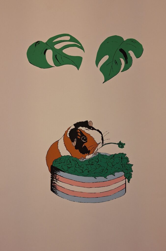
Favourite drawing- this is Laika, my daughter’s guinea pig. I drew the picture from a photo and then planned out all my layers for screen printing. I really like the colours that I mixed for this project. I was also very satisfied with my drawing of the guinea pig- it feels like it is in motion- I can imagine him nibbling on the leaves.
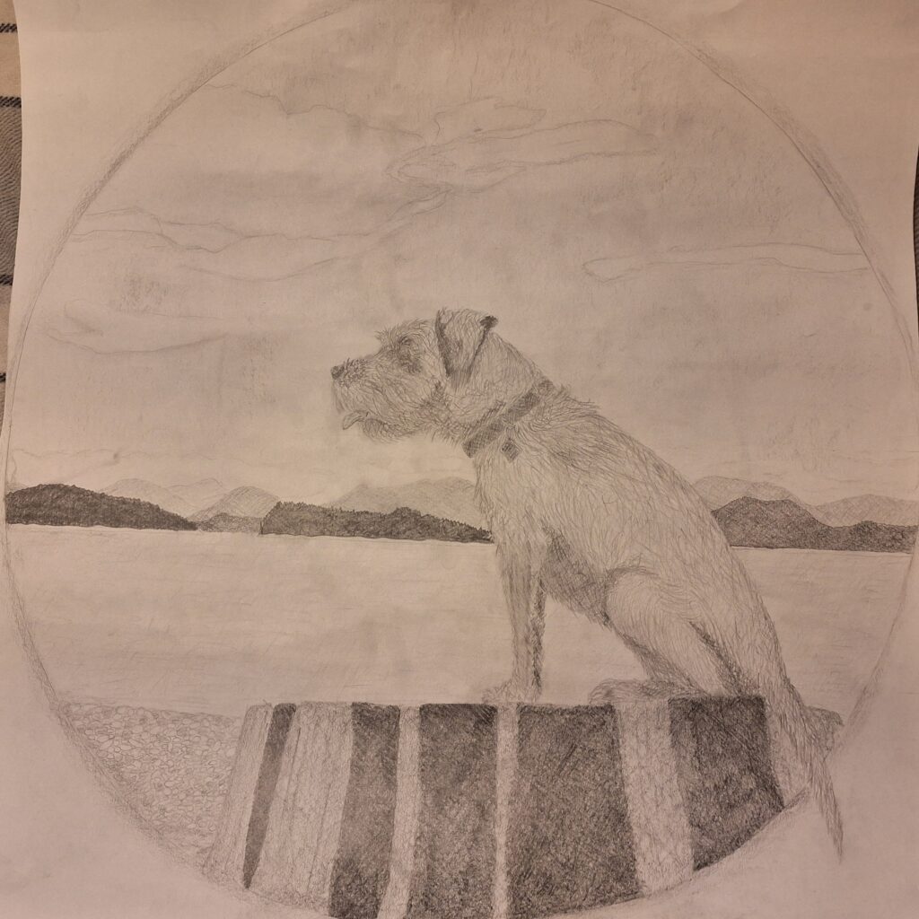
My least favourite drawing is from my first Fine Arts class when I was learning how to create value and tone with graphite. I do still like the drawing as I know I gave a lot of time and effort into doing my best. It just reminds me of things I’m learning to do better. The drawing is of my dog, Kenzie at Rebecca Spit.
In my transformation project, I plan to use vibrant colours (from my favourite) and work with value and tone (from my least favourite).
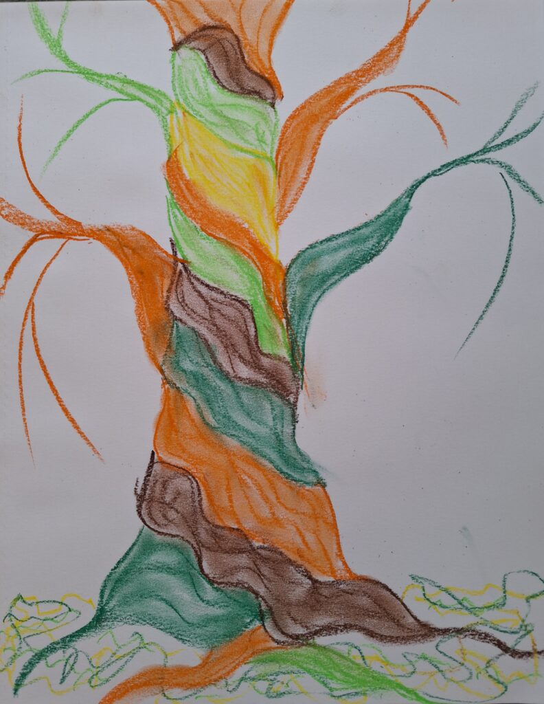
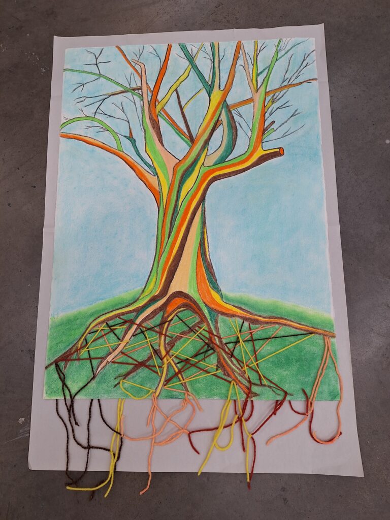
I envisage a drawing of a tree on paper using chalk pastel and conte. The trunk may be twisting around with roots reaching down and branches reaching up (as described in my theme presentation on page 1). Or it may be the branches reaching round. It may be a maple or a cedar tree or a tree of my own design.
Colour Palette Ideas
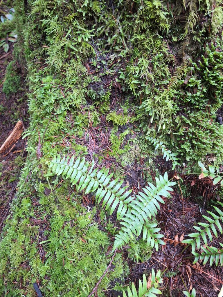
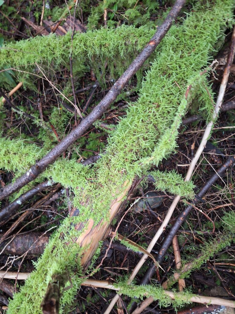
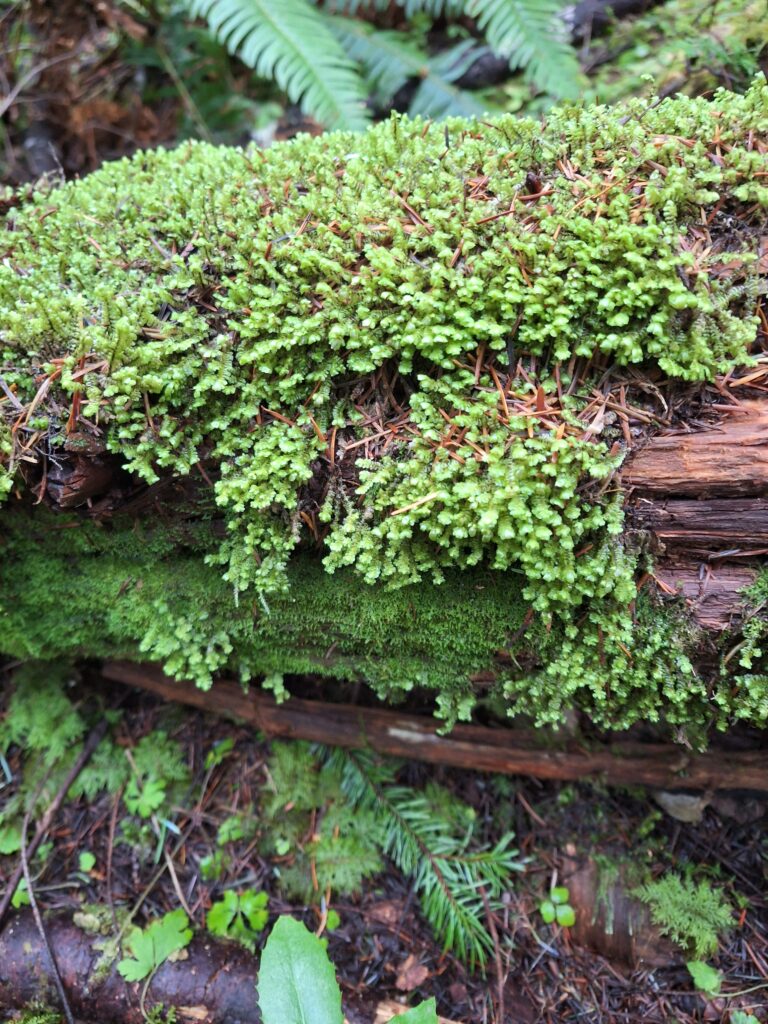
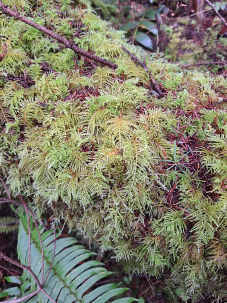
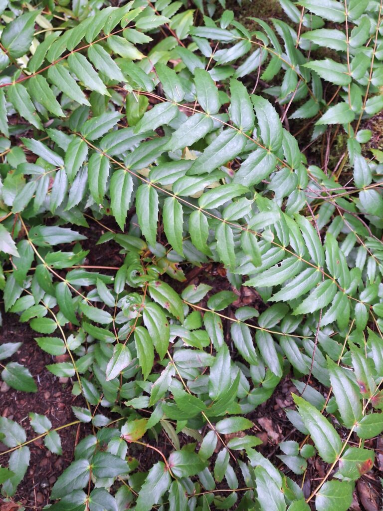
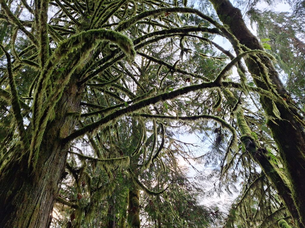
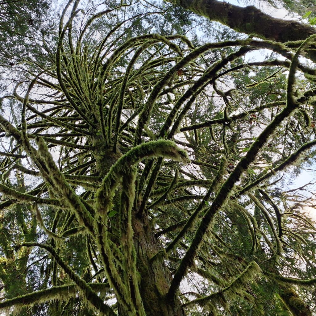
Forest Reference Photos
Experimenting with chalk pastelle
More trees (Maples)
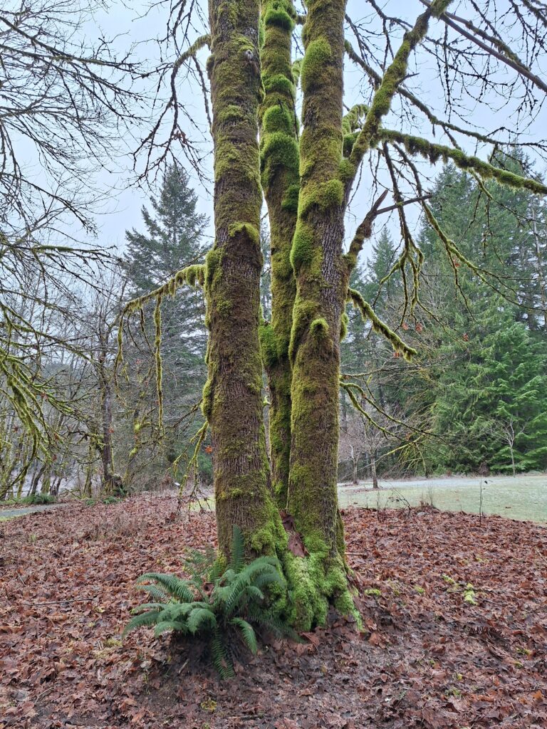
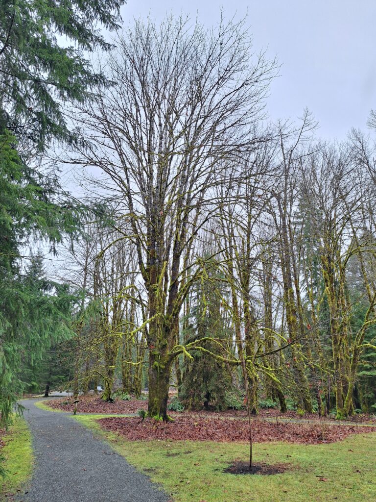
I went out and about in Cumberland and looked for interesting trees to help inspire this project.
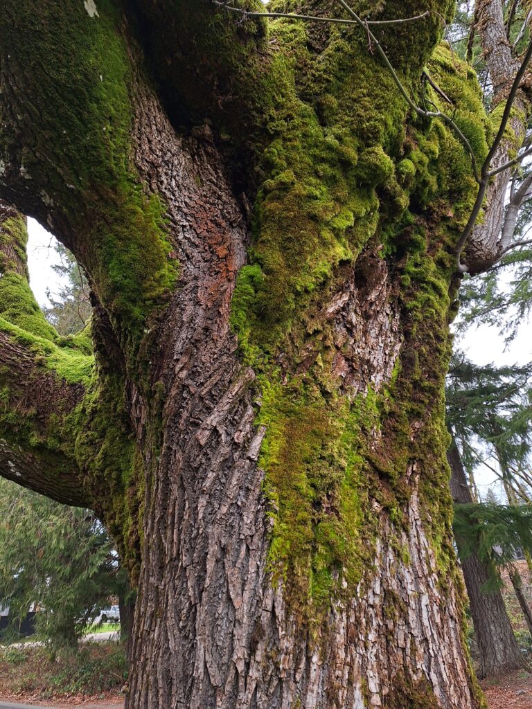
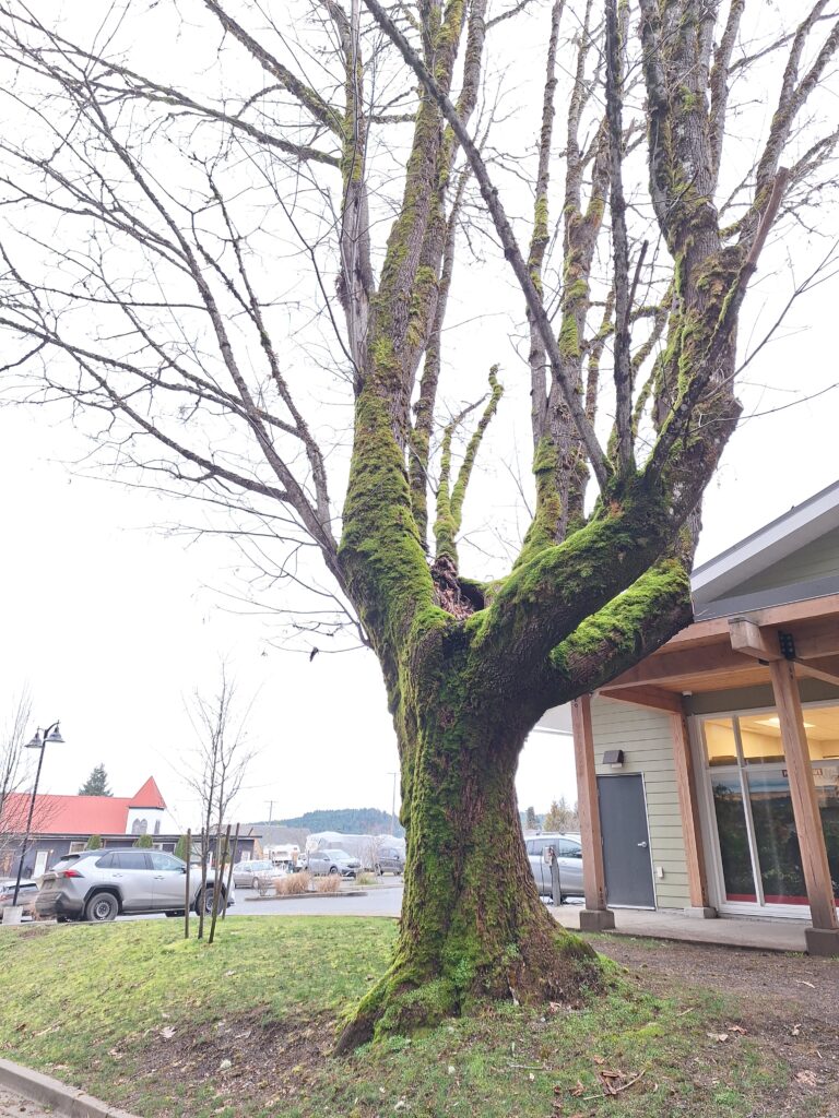
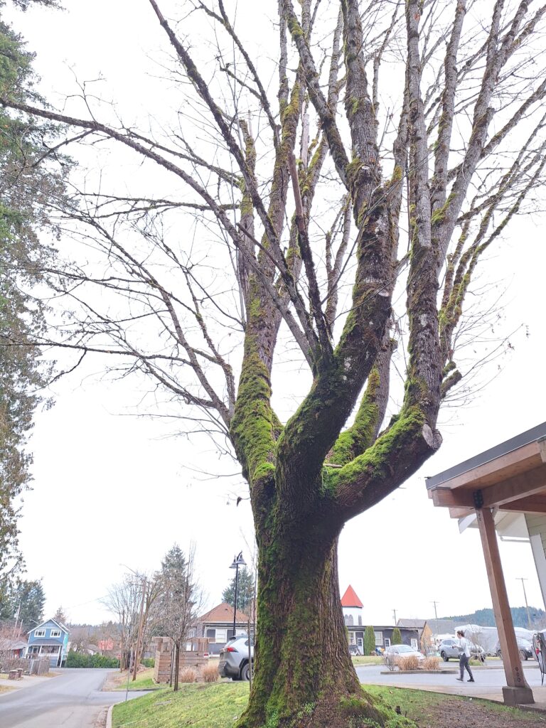
This tree has a beautiful twist in its trunk and on up into the branches. It has been heavily pruned as there is a relatively new building next to it but I can imagine the fullness of the branches in its prime.
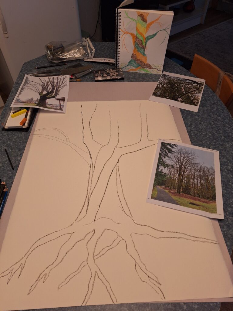
I was very apprehensive to start my drawing on the large sheet of paper. So I decided to map out the composition using charcoal. I used numerous photos to help inform my drawing- all taken by me. I like the way the tree looks strong- almost muscular. It’s hard to explain but I’m in a place of vulnerability in my life and creating an image of strength and beauty feels empowering.
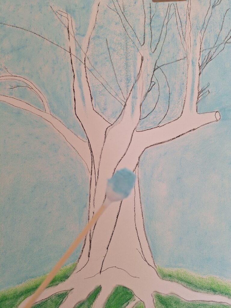
I found out that it would be good to put background colours in at this stage. I also learned that cotton buds of different sizes can be very effective to blend and smooth the pastels.

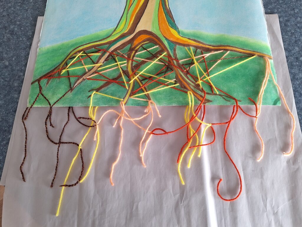
I began laying down bands of colour. I chose them intuitively but also stepped back quite often to get a wider view and help me decide on which colour to use next. The colours and shapes represent the strength and beauty of the tree, even in winter as it waits for spring to come.
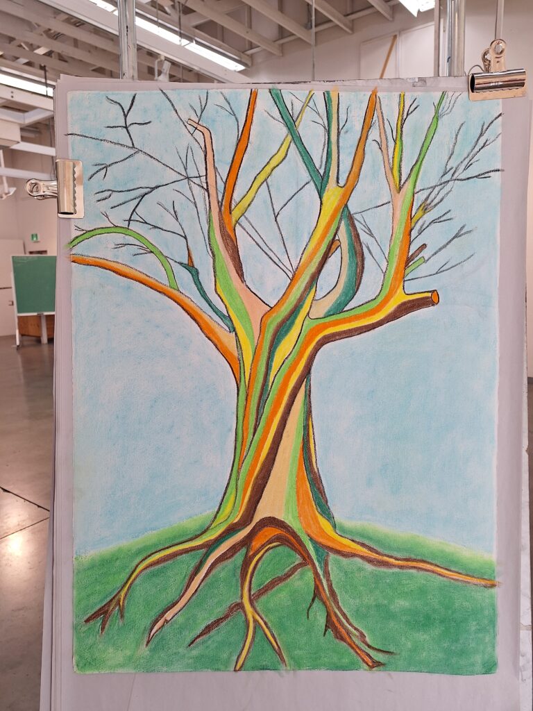

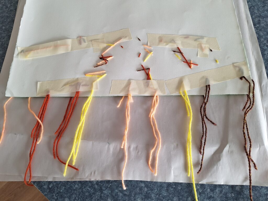
I had thought to draw the underground networks but finally decided to use yarn, which I sewed through the paper and attached with masking tape at the back. I also tied some of the threads together to suggest an organic aspect.
I have really endeavoured to keep the pastels crisp and clear. I also used charcoal for outlining. Originally the charcoal was to be and under-drawing but I decided I like the look of it so I retraced the lines for clarity.
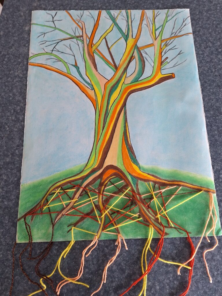
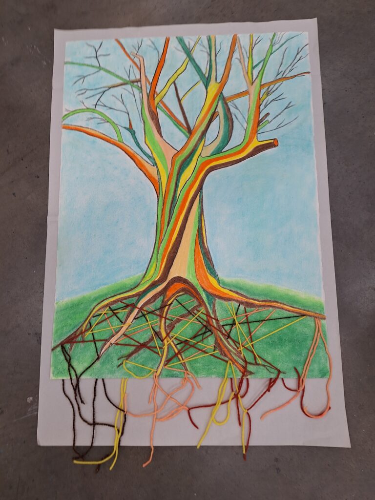
The title of my drawing is ‘Hidden Strength’, which relates to the tree with its underground micorrhizal networks and also to myself and the strength I tap into through my relationships with family, friends and community. Being in a vulnerable state of health as I currently am, I find this drawing and the experience of creating it to be empowering, encouraging and uplifting.
Least and most favourite drawings component: I feel that my drawing is successful in developing my use of vibrant colours and also in creating more value and depth in the way I laid down colour.
I may have shared this poem before but it really describes this tree:
Mother Tree
.
She has seen more of life
than I can fathom
more springs, more fires
more saplings, more bears
than I can imagine
.
She orchestrates healthcare
nutrition and pest alerts
through the fine lace of mycelium
the lattice of mycorrhizal networks
woven around roots and hairs
intricate, intelligent
an alliance
built over centuries
.
Her Wood-Wide-Web
is the lifeline of the forest
the lifeblood of existence
.
She is mother, grandmother
great-grandmother,
the ever-giving Mother Tree
.
By Carys Owen